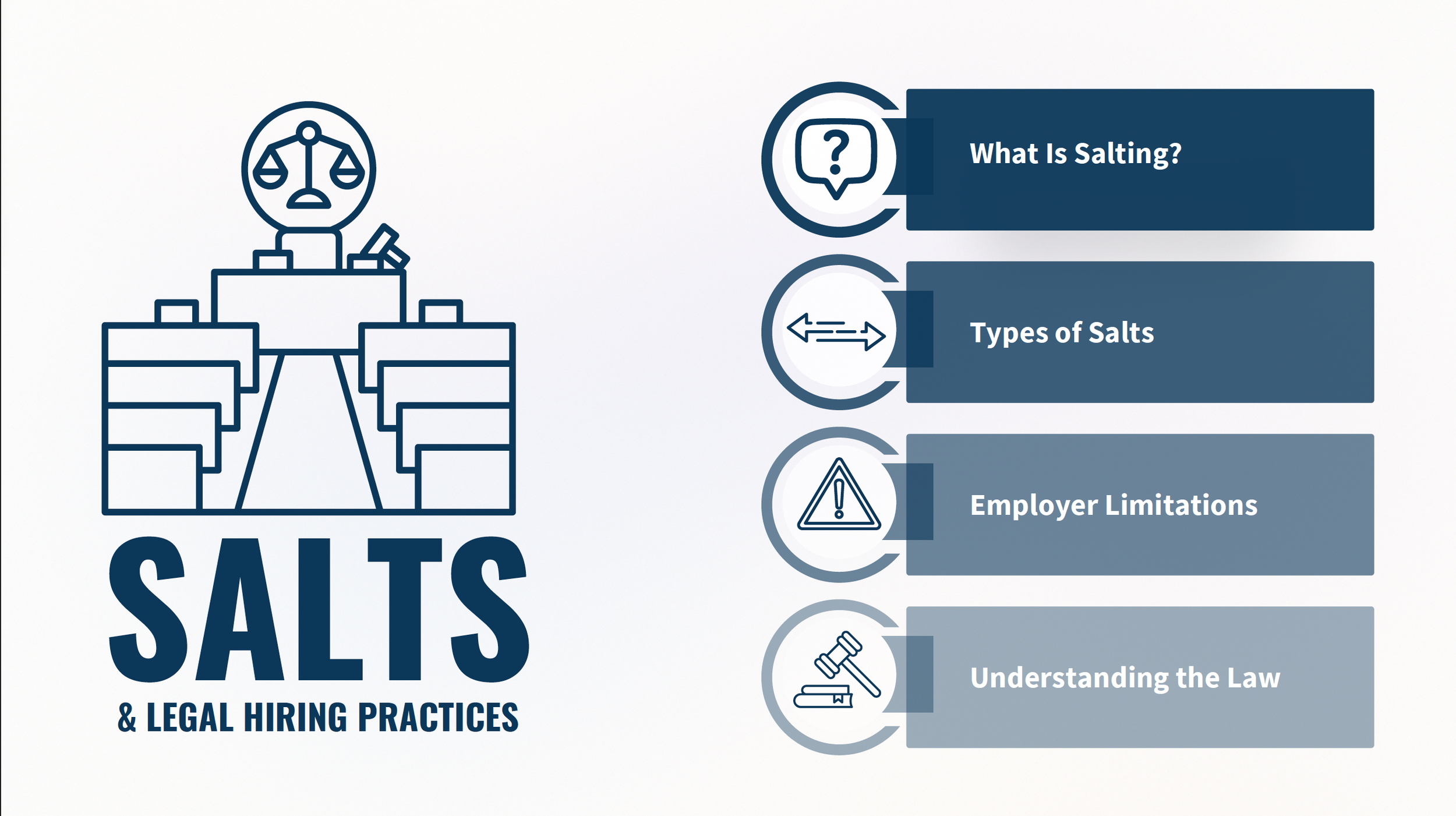
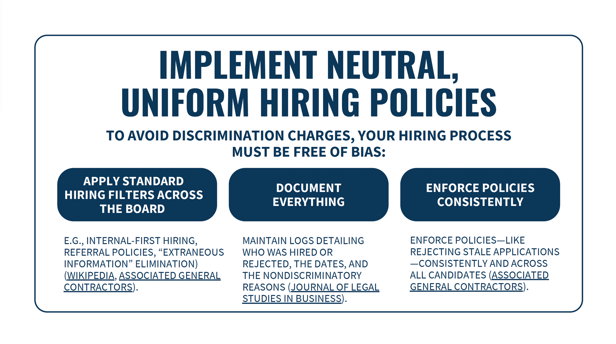
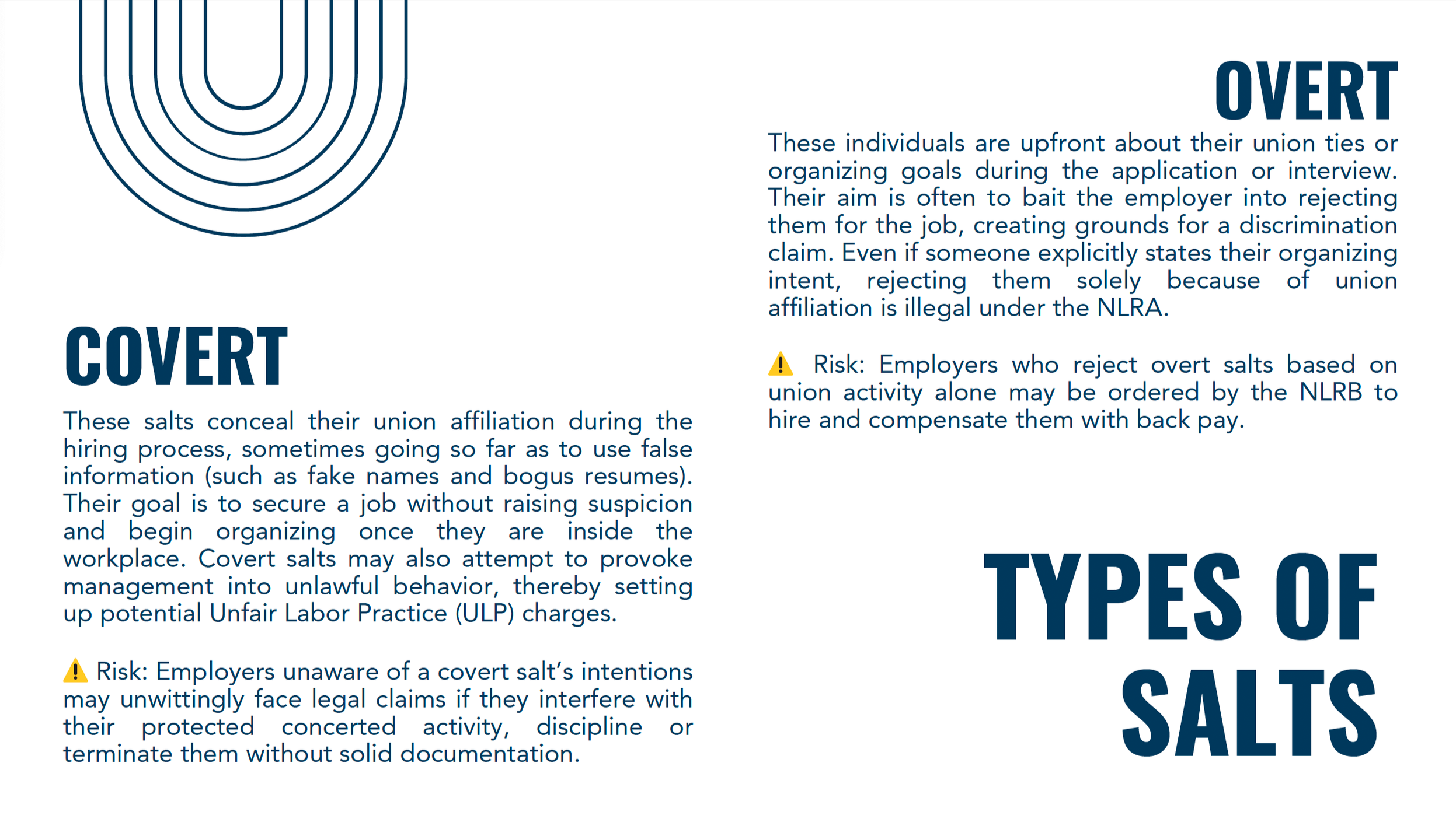
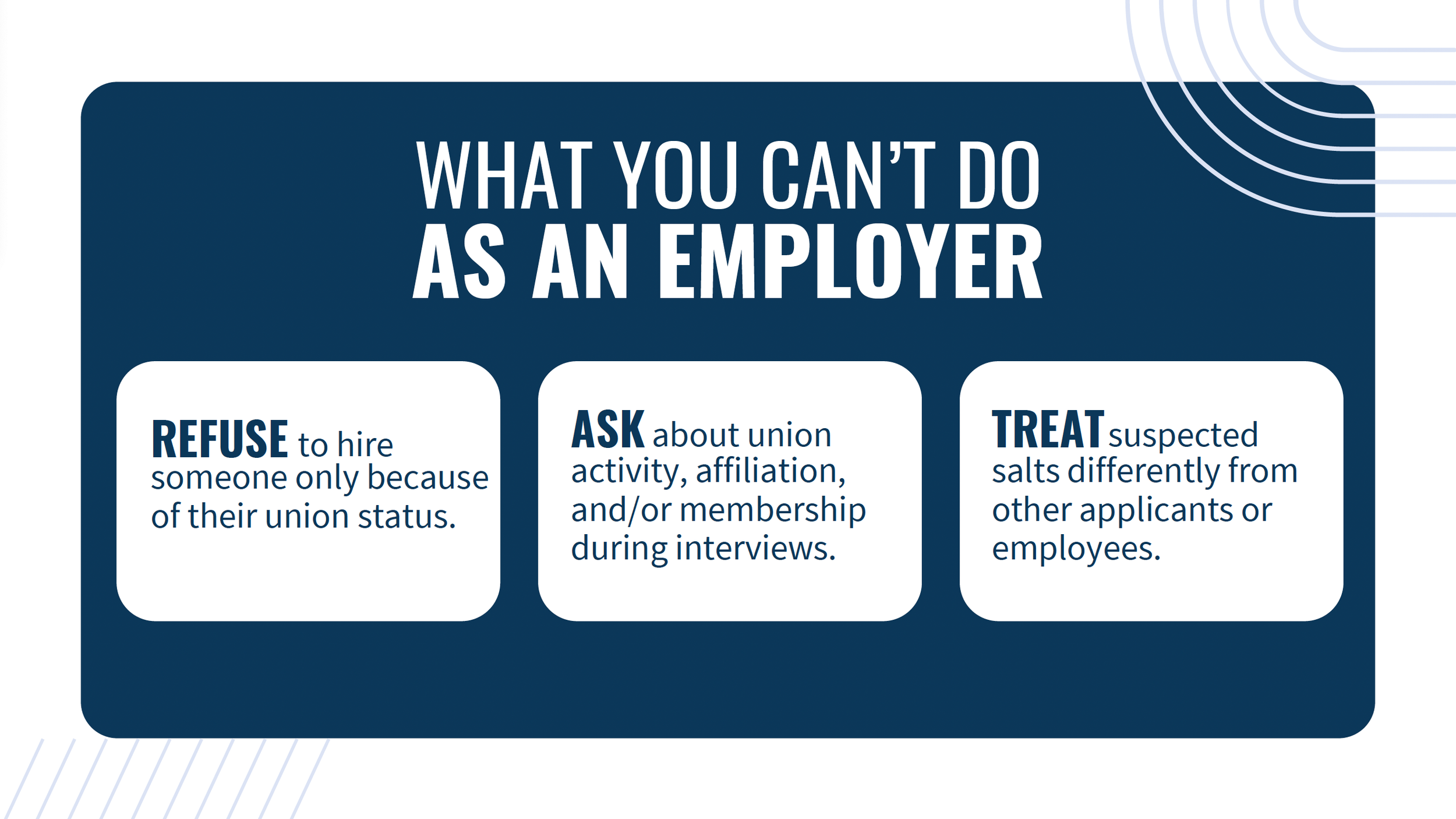
SALTS: A Presentation On Legal Hiring Practices For Internal Communications.
My strategic use of color, icons, and callouts helps guide attention to key risks, legal distinctions, and takeaways, while maintaining a professional tone appropriate for an employer-facing audience. I utilized spacing, alignment, and visual repetition to create rhythm and consistency across slides.
Overall, this presentation reflects my approach to information-heavy design: reduce cognitive load, surface what matters most, and support informed decision-making through clear visual structure.
For this presentation, my design process centered on translating dense legal and labor-relations concepts into a clear, structured, and digestible visual narrative. Visually, I prioritized clarity and hierarchy over decoration, using strong typographic contrast, concise section headers, and modular layouts to break complex information into manageable segments.
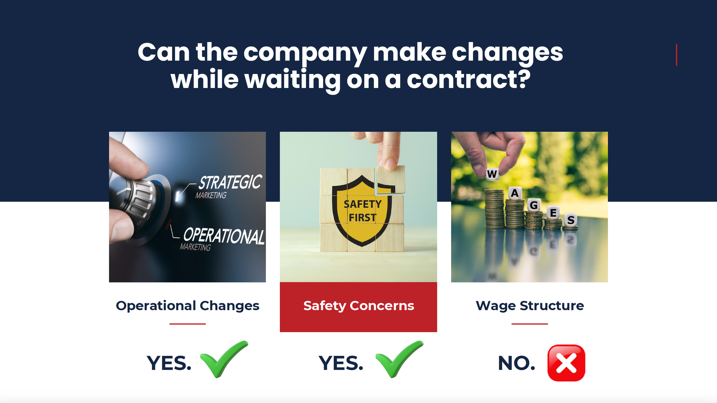
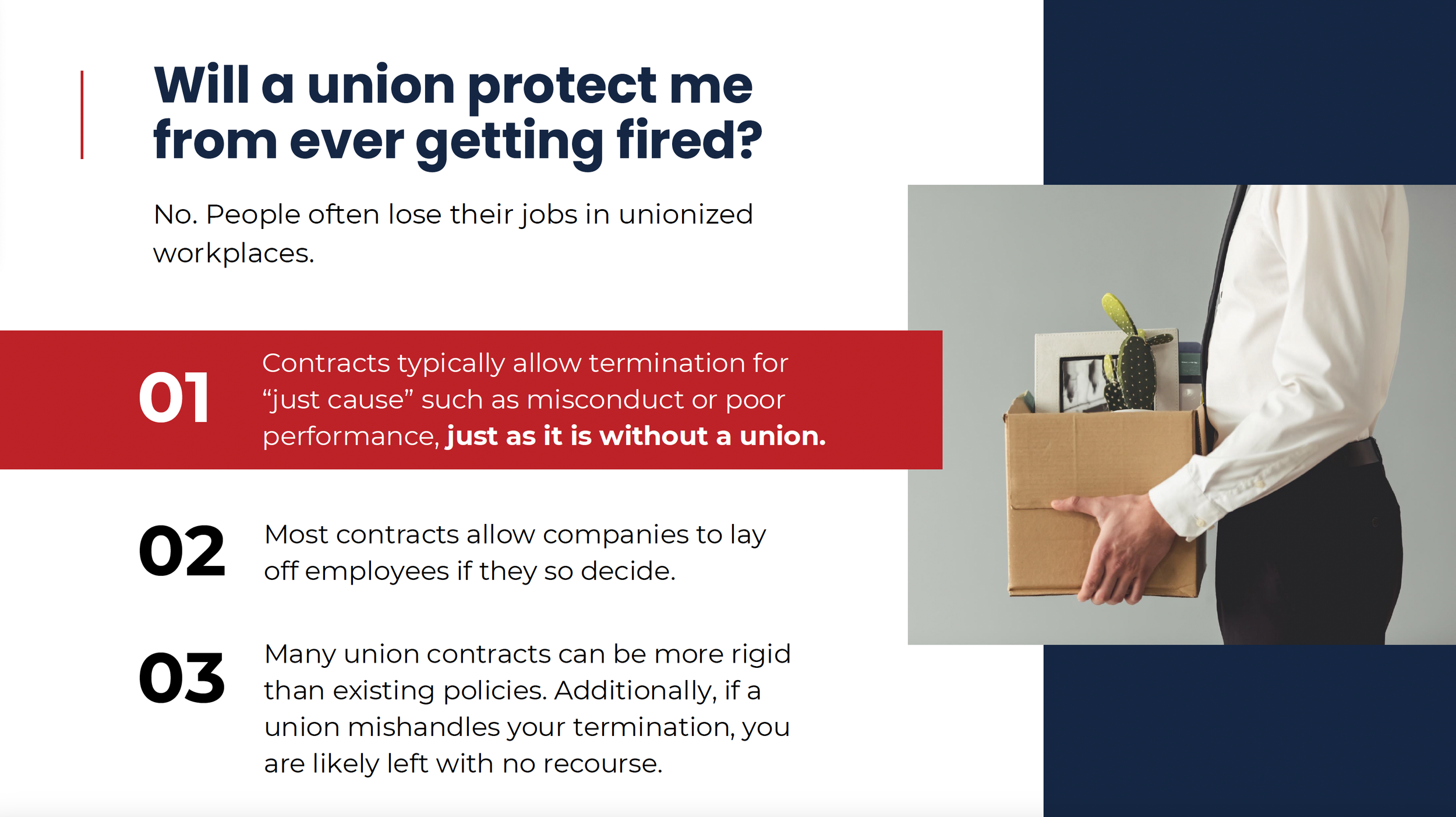
Common Questions: A Q&A Style Presentation On Union Representation For Employee-Facing Communications.
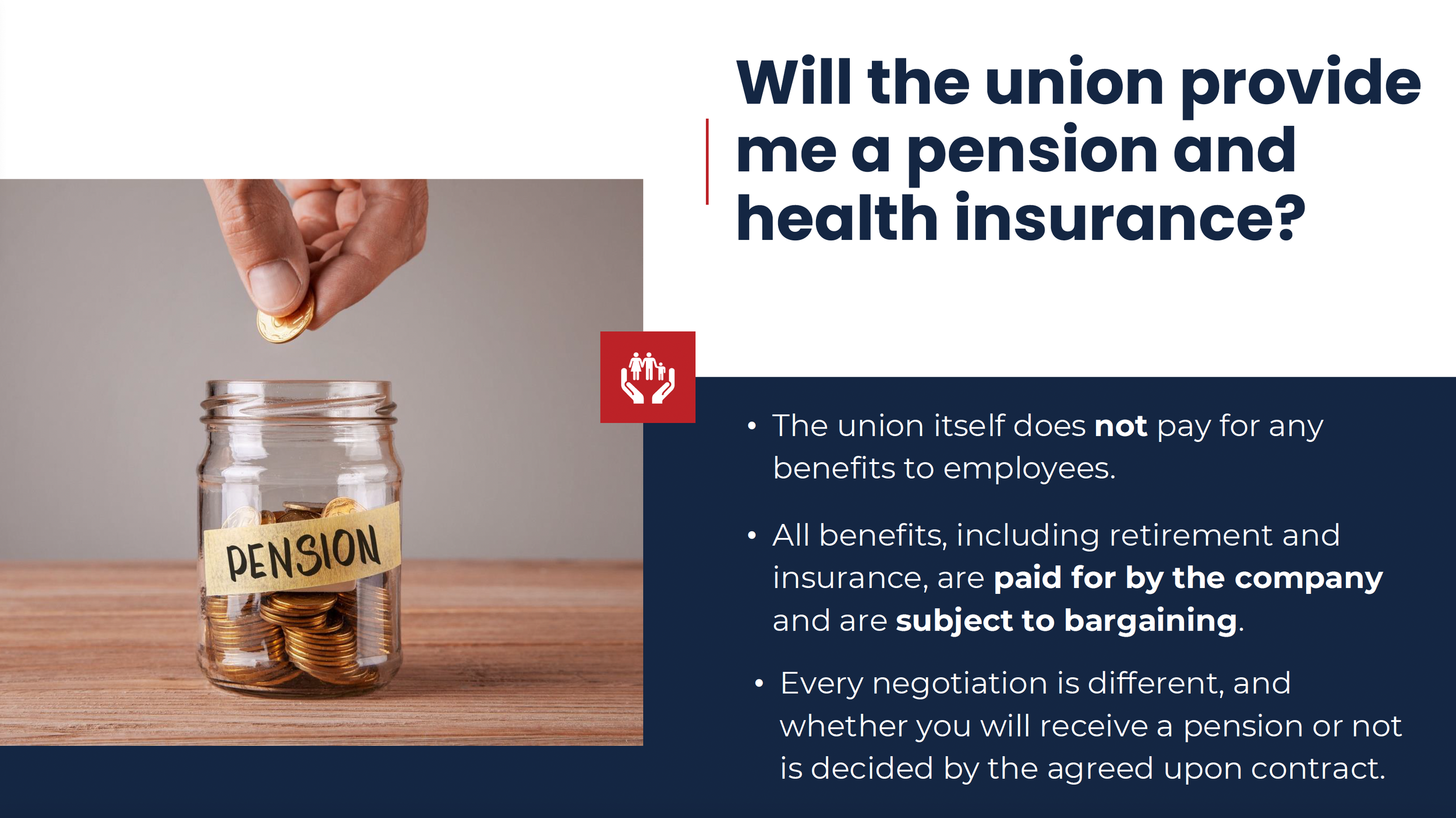
Here, I prioritized bold color choices and clean lines to convey credibility and ease of understanding for the viewer.
This presentation reflects my ability to adapt content-heavy material into compelling, on-brand visual narratives across professional contexts.
For this presentation, my design approach prioritized clarity, professionalism, and readability, while incorporating visual elements like icons, callouts, and slide transitions to maintain engagement and flow. I worked within the client’s existing informational content, developing a cohesive visual system through intentional use of color, typography, and hierarchy to ensure clarity and impact in the messaging.