Email Campaign Redesign - Marketing Guides

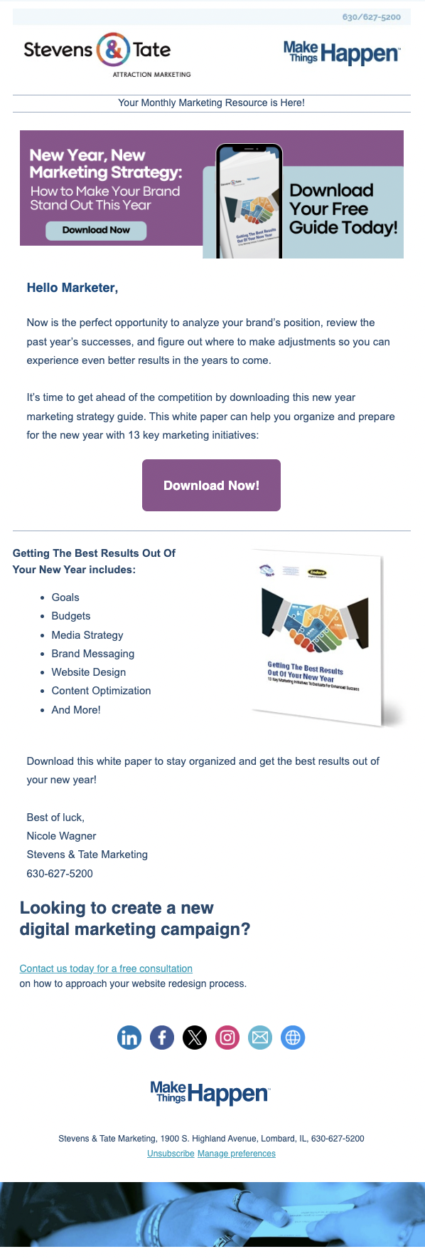
Before:
The Process:
For this redesign, my goal was to elevate the visual clarity and aesthetic appeal of the email while making the primary call to action immediately clear and engaging. The original version contained all of the necessary content, but it lacked a strong visual hierarchy and relied heavily on text, which made the email feel dense and easy to skim past.
I began by rethinking the above-the-fold experience, knowing that email readers decide within seconds whether to engage. I introduced a bold purple hero section to create a strong visual anchor at the top of the email and clearly separate the headline and CTA from the rest of the content. This color choice was intentional, adding warmth and contrast while still aligning with the brand’s existing palette, helping the message stand out in crowded inboxes.
Overall, the redesign transforms the email from a text-heavy announcement into a visually compelling, structured experience that guides the reader naturally from headline to CTA. The result is an email that feels more confident, more contemporary, and more aligned with modern email design best practices—while still respecting the brand’s identity.
Email Campaign Design - Case Studies
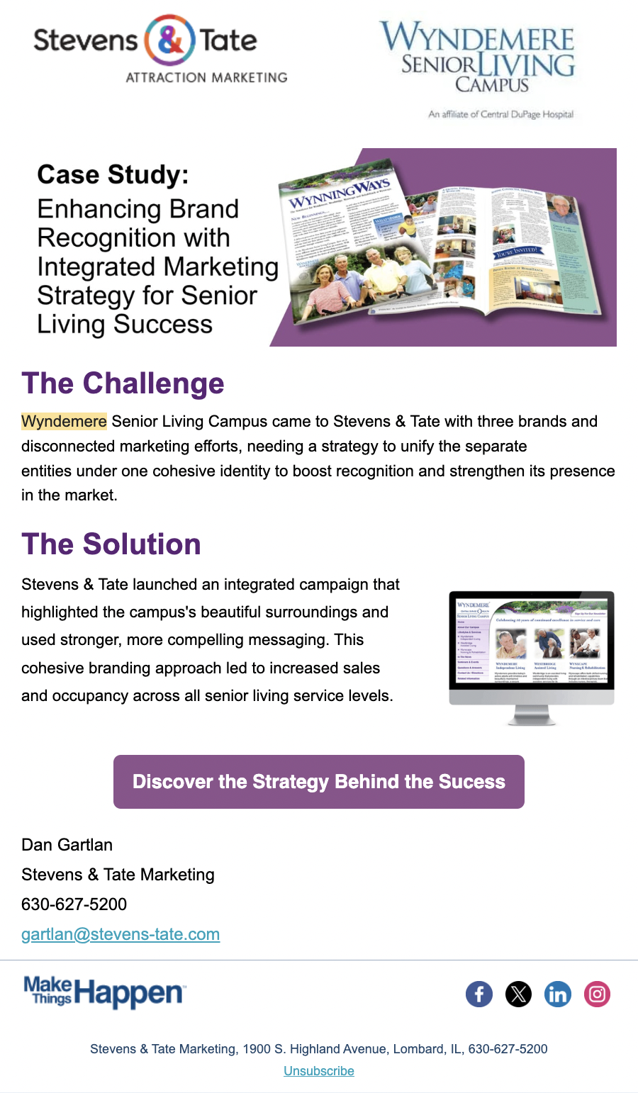
The Process:
For these marketing emails, I focused on balancing clarity, brand consistency, and conversion. My process began with identifying the primary goal of each email, which was driving engagement to the company’s case studies. I then focused on structuring the content hierarchy to guide readers naturally from headline to call-to-action.
Visually, I leaned into each client’s established brand system, using color blocking and strong typographic contrast to make long-form content feel scannable and approachable. Large, attention-grabbing headlines anchor the designs, while supporting imagery tells a visual story of the work without overwhelming the message.
I was intentional about spacing, alignment, and repetition to create rhythm and improve readability across devices, ensuring the emails performed well in both desktop and mobile contexts. Strategic CTA placement and color contrast were used to draw attention at key decision points, supporting both usability and performance goals.
Overall, these designs reflect my approach to email marketing as a content-driven experience where thoughtful layout, brand expression, and user behavior work together to tell a compelling story and encourage interaction.

After: